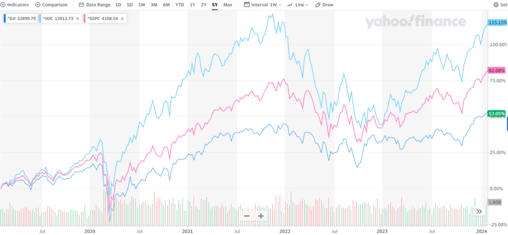
I stumbled upon a perfect example of how risk tolerance works. It can be best explained using this visual:

The lines on the chart represent the Nasdaq, S&P 500, and the Dow Jones Industrial Average over the last 5 years.
As you can see, the Nasdaq has performed the best (~111%), followed by the S&P (~82%) and the Dow (~52%)
It also stands out that while all of these have grown, the “riskier” indexes have fluctuated more in value.
This is what describes risk — how much the price of an asset fluctuates in relation to its growth.
If you are trying to figure out what risk level is best for you, consider if the potential for a higher return is worth your investments losing value during pullbacks in the market. A person with a long investment horizon typically can take more risk than someone who will need access to their funds sooner.
In Christ,
Grayson Shaw
Investment Advisor Representative


